The Julia plotting system is available from a set of packages each one using its own syntax. The most important examples are the Plots and Gadfly packages. In this post, we will take a look at the basic functionalities from these libraries.
Before we start playing around, the first thing to do is to install the necessary packages:
using Pkg
Pkg.add("Plots")
Pkg.add("GR")
Pkg.add("PyPlot")
Pkg.add("Gadfly")
Now let’s get started!!
The Plots package
The most basic plot that we can do is a line plot. We can plot a line by calling
the plot() function on two vectors:
using Plots
x = 1:10;
y = rand(10, 1);
plot(x, y)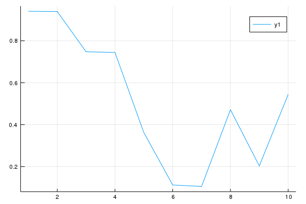
In Plots, every column is treated as a series. Thus, we can plot multiple lines by plotting a matrix of values where each column will be interpreted as a different serie:
y = rand(10, 2);
p = plot(x, y)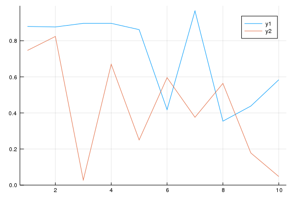
We can modify an existing plot by using the modifier function plot!(). For instance,
let’s add one more line to the previous plot:
z = rand(10);
## adding line z to plot p:
plot!(p, x, z) 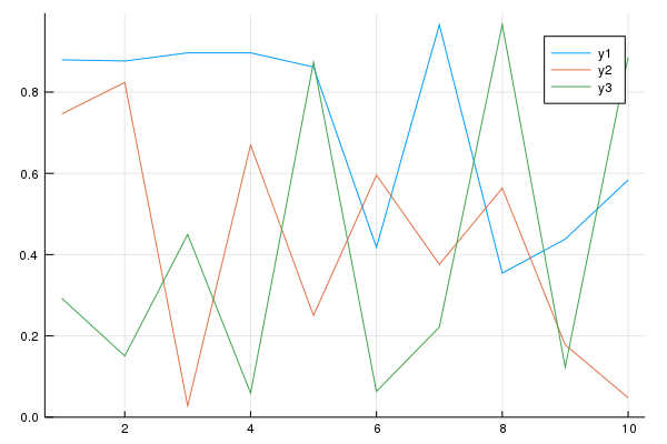
Notice that I specified the plot (p) to be modified on the last calling. We could
just call plot!(x, z) and the plot p would be modified because the Plots
package will look for the latest plot to apply the modifications.
Plots Attributes
Not only we want to make plots, but also make them look nice, right?! So, in order
to do that we can tweak the plot attributes. The Plots package follows a simple
rule with data vs attributes: positional arguments are input data, and keyword
arguments are attributes. For instance, calling plot(x, y, z) will produce a 3-D plot, while
calling plot(x, y, attribute = value) will output a 2D plot with an attribute.
To illustrate this, let’s add a title and modify the legend labels for our previous plot:
p = plot(x, y,
     title = "My beautiful Plot", ## adding a title
     label = ["1", "2"]) ## adding legend labels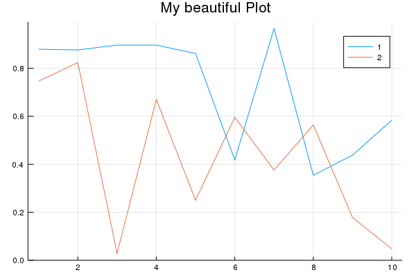
Additionally, we can use modifiers functions to customize our plots. For example,
let’s say we wanted to add a label for the y-axis and x-axis. We could just add
the argument xlabel = "..." and ylabel = "..." on the last call, or we could
use the modifier functions xlabel!() and ylabel!():
xlabel!(p, "My customized x label")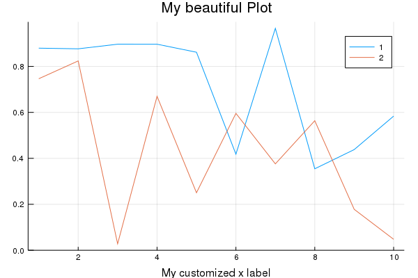
ylabel!(p, "My customized y label")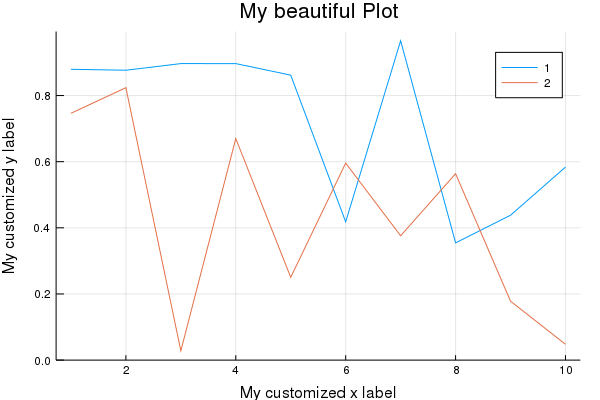
Also, we can customize the line colors, as well as adding markers and even annotations to the plot:
markershapes= [:circle :star5];
markercolors= [:orange :green];
plot(x, y,
     title = "My beautiful Plot",
     xlabel = "My customized x label",
     ylabel = "My customized y label",
     label = ["1", "2"],
     color = markercolors,
     shape = markershapes,
     annotation = [(4, .9, "Look at me!!")])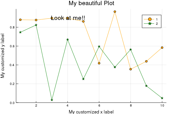
Of course, not only plotting lines can a data scientist survive, right?! In Plots,
we can make other types of plots just by adjusting the seriestype = "..." attribute.
For instance, instead of a line plot, we can make a scatter plot:
x = rand(20);
y = rand(20);
plot(x, y, seriestype = :scatter, legend = false, color = [:blue])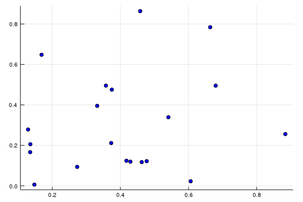
Also, we can make a bar plot:
x = 1:10;
y = sin.(x);
plot(x, y, seriestype = :bar, legend = false)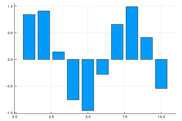
and to make a histogram, we can do:
using LaTeXStrings
mathstring = L"X \sim \mathcal{N}(0,\,1)";
plot(randn(1000), seriestype = :histogram, legend = false, title = mathstring)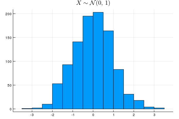
Notice that we can also add LaTeX notation in the plot using the functionalities from the LaTeXStrings package.
There are a large numbers of plot attributes we can tweak. This is just the tip of the iceberg. For more detail, please refer to official documentation.
Plot Backend
Now, let me tell something:
Plots is not a plotting package!!
What??? That’s right!! Plots is what is called a metapackage. Its aim is to bring many different plotting packages under a single API (interface). What do you mean by that, Cleyton?
Well… in Julia we have access to different plotting packages such as PyPlot (Python’s matplotlib), Plotly, GR and some others. Each one have different features which can be very useful for certain situations. However each one has its own syntax. So, in order to get the most from these packages, you would have to learn their syntax.
That’s when Plots comes at hand! Instead of learning different syntaxes, Plots package provides you access to different plotting packages (called backends) using just one single syntax. Then, Plots interprets your commands and then generates the plots using another plotting library. That is, this means you can use many different plotting libraries, all with the Plots syntax, only by specifying which backend you want to use. That’s it! Just like that!.
Up until now, our plot was using the default backend. The default depends in what
plotting package you have installed in Julia. Some common choices for backends (plotting package)
are PyPlot and GR. To install these backends, simply use the standard Julia
installation Pkg.add("BackendPackage").
In order to specify which backend we want to use just use the name of the backend in lower case as a function:
x = 1:10;
y = rand(10, 2);
## specifying pyplot backend:
pyplot()
## Plots.PyPlotBackend()plot(x, y, title = "using Pyplot", shape = :cirle)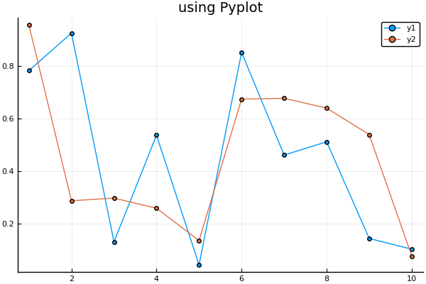
See?! Very easy! You can kepp changing the backend back and forth just like that. The choice of backend depends on the situation. Usually, I prefer to use Plotly when I want to make interactivity plots, GR to make simple and quick plots (for example, in an exploratory data analysis situation), and PyPlot otherwise.
In order to save the plots we use the savefig() command:
# saves the current plot:
savefig("myplot.png")
# saves the plot from p:
savefig(p,"myplot.pdf")
For more information on backends, please refer to the official documentation.
Recipe Libraries
Recipes libraries are extensions that we can use with Plots framework. They add more functionalities such as default interpretation for certain types, new series types, and many others.
One of the most important recipe libraries is StatsPlots, a package comprising
a set of new statistical plot series for a certain data type. We can install this
library using Pkg.add("StatsPlots") command. The StatsPlots package
has a macro @df which allows you to plot a DataFrame directly by using the
column names. We can specify the column names either as symbol (:column_name) or
as string (“column_name”):
using StatsPlots
using DataFrames
## creating a random DataFrame
df = DataFrame(a = 1:10, b = rand(10), c = rand(10));
## Plotting using the @df macro specifying colum names as symbol:
@df df plot(:a, [:b :c], color = [:red :blue])
We can also make a call for @df using the cols() utility function. This function
allows us to specify the column using a positional index:
@df df plot(:a, cols(2:3), color = [:red :blue])StatsPlots also contains the corrplot() and cornerplot() functions to plot
the correlation among input variables:
@df df corrplot(cols(2:3))
@df df cornerplot(cols(2:3))
Of course, there are more functionalities from the StatsPlots library than I have showed here. For more detail, please refer to official documentation.
The Gadfly Package
Now, let me be honest with you: this is my favorite one!! Gadfly is another package used to create beautiful plots in Julia. This package is an implementation of the “grammar of graphics”style. For those who have R experience, this is the same principle used in the wonderful ggplot2 package.
In order to start playing with Gadfly, we need some data. Let’s make use of the RDatasets package which give us access to a list of the datasets available from R.
Pkg.add("RDatasets")When used with a DataFrame, we can use the plot() function with the following syntax:
plot(data::DataFrame, x = :column_name, y = :column_name, geometry)where the geometry argument is just the series type you want to plot: a line, point,
error bar, histogram, etc.
Notice something: Plots and Gadfly use the same name for the plotting function.
To avoid confusion in Julia about which plot() function to call, we can specify
from which package we want the call to be made by using the Gadfly.plot() syntax.
For those who have an R background, this syntax is equivalent to name_package::function_name()
in R.
Now, let’s use the iris dataset to start playing around with Gadfly:
using RDatasets
iris = dataset("datasets", "iris");
first(iris, 5)
## 5×5 DataFrame
## │ Row │ SepalLength │ SepalWidth │ PetalLength │ PetalWidth │ Species │
## │ │ Float64 │ Float64 │ Float64 │ Float64 │ Categorical… │
## ├─────┼─────────────┼────────────┼─────────────┼────────────┼──────────────┤
## │ 1 │ 5.1 │ 3.5 │ 1.4 │ 0.2 │ setosa │
## │ 2 │ 4.9 │ 3.0 │ 1.4 │ 0.2 │ setosa │
## │ 3 │ 4.7 │ 3.2 │ 1.3 │ 0.2 │ setosa │
## │ 4 │ 4.6 │ 3.1 │ 1.5 │ 0.2 │ setosa │
## │ 5 │ 5.0 │ 3.6 │ 1.4 │ 0.2 │ setosa │First, let’s plot a scatter plot using SepalLength and SepalWidth variables.
To specify that we want a scatter plot, we must set the geometry element using
Geom.point argument:
using Gadfly
Gadfly.plot(iris, x = :SepalLength, y = :SepalWidth, Geom.point)
We can keep adding geometries to produce more layers in the plot. For instance, we
can add lines to the plot just adding the Geom.line argument:
Gadfly.plot(iris, x = :SepalLength, y = :SepalWidth, Geom.point, Geom.line)
Also, we can set the keyword argument color according to some variable to specify
how to color the points:
Gafdfly.plot(iris, x = :SepalLength, y = :SepalWidth, color = :Species, Geom.point)
Gadfly has some special signatures to make plotting functions and expressions more convenient:
Gadfly.plot((x,y) -> sin(x) + cos(y), 0, 2pi, 0, 2pi)
So, as you have noticed that the call from Gadfly.plot() will render the image to your default
multimedia display, typically an internet browser. To be honest, I do not know why this the
default behavior. In order to render the plot to a file, Gadfly supports creating SVG images out of the box.
The PNG, PDF, PS, and PGF formats require Julia’s bindings to cairo
and fontconfig, which can be installed with:
Pkg.add("Cairo")
Pkg.add("Fontconfig")
To save to a file, we use the draw() function on the chosen backend:
p = Gadfly.plot((x,y) -> sin(x) + cos(y), 0, 2pi, 0, 2pi);
## saving to a pdf device:
draw(PDF("plot.pdf", p))
## or to a png device
draw(PNG("plot.pdf", p))
Geometries
Gadfly presents a lot of geometry format options. As we have seen, to plot more
geometries to a figure we can just add more geometry types. The most common ones are
Geom.line, Geom.point, Geom.bar, Geom.boxplot, Geom.histogram,
Geom.errorbar, Geom.density, etc.
We already saw Geom.line and Geom.point. So now let’s plot the other geometry types
in one figure using the gridstack() function:
p1 = Gadfly.plot(dataset("ggplot2", "diamonds"), x= :Price, Geom.histogram);
p2 = Gadfly.plot(dataset("HistData", "ChestSizes"), x = :Chest, y = :Count, Geom.bar);
p3 = Gadfly.plot(dataset("lattice", "singer"), x = :VoicePart, y = :Height, Geom.boxplot);
p4 = Gadfly.plot(dataset("ggplot2", "diamonds"), x = :Price, Geom.density);
gridstack([p1 p2; p3 p4])
Theme
We can tweak the plot appearance by using the Theme() function. Many parameters
controlling the appearance of plots can be overridden by passing this function
to plot() or setting the Theme as the current theme using push_theme().
For instance, we can change the label and size label:
Gadfly.plot(x = rand(10), y = rand(10),
             Theme(major_label_font = "Hack",
                   minor_label_font = "Hack",
                   major_label_font_size = 16pt,
                   minor_label_font_size = 14pt,
                   background_color = "#bdbdbd"))
There are a lot of options we can tweak in Theme(). This is just the surface.
For the full list of options, see this link.
Calling ggplot2
The Plots and Gadfly package are the two main plotting packages for Julia. Each one have different characteristics and a syntax on their own.
However, let’s say you have an R background and you are very used to the wonderful ggplot2 package and would rather not to learn another plotting system. Or it might be the case that while you are still learning the Julia plotting system you have to create very well crafted plots for your report but you only know how to do it in ggplot2.
What if I told you there is a way to use Julia and still make plots using ggplot2 package? Well, in order to do that we will use the RCall package. First of all, let’s install this package:
Pkg.add("RCall")RCall is package with the aim of facilitating communication between R and Julia languages and allows the user to call R packages from within Julia, providing the best of both worlds.
In order to call ggplot2 package from Julia, we use the @rlibrary syntax to
load the R package. Then, we can use R"" syntax to call the R command:
using RCall
@rlibrary ggplot2
gasoline = dataset("Ecdat", "Gasoline");

## notice that we use $name_dataset inside R"" command.
R"ggplot($gasoline, aes(x = Year, y = LGasPCar, color = Country)) +
  geom_line() +
  geom_point() +
  ggthemes::theme_economist_white(gray_bg = F) +
  theme(panel.grid.major = element_line(colour = '#d9d9d9',
                                        size = rel(0.9),
                                        linetype='dashed'),
        legend.position = 'bottom',
        legend.direction = 'horizontal',
        legend.box = 'horizontal',
        legend.key.size = unit(1, 'cm'),
        plot.title = element_text(family= 'AvantGarde', hjust = 0.5),
        text = element_text(family =  'AvantGarde'),
        axis.title = element_text(size = 12),
        axis.text.x = element_text(angle = 0, hjust = 0.5),
        legend.text = element_text(size = 12),
        legend.title=element_text(face = 'bold', size = 12)) +
  labs(title = 'Gas Consumption over the years', x = '', y = '')"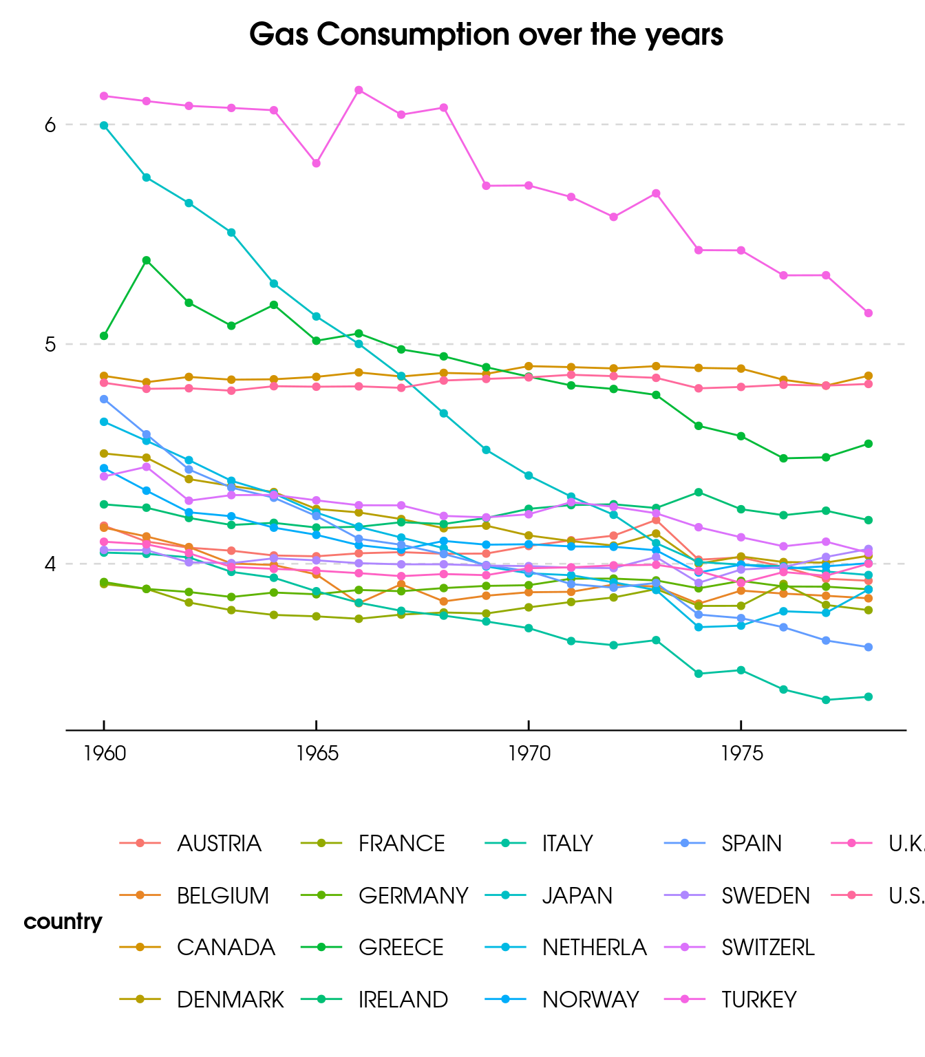
That’s it!!! Now, You do not need to leave Julia in order to make your plots with ggplot2.
Conclusion
In this post we saw basic functionalities of the main packages from the Julia plotting system. Plots and Gadfly stand out as the major players when it comes to plotting in Julia.
The Plots package is not really a plotting package but rather an API to call other plotting libraries using a common syntax. Its functionalities kind of resembles the ones from the base plotting system in R.
On the other hand, the Gadfly is an implementation of the “grammar of graphics” style once found in the already consolidated ggplot2 package from R. It resambles many of the functionalities found in ggplot2 and highly customizable.
Which package is better depends on the case and, of course, in your preferences. Personally, I am very satisfied with Gadfly because of the similarities with ggplot2, but Plots package offers some handy functionalities throught recipes libraries, for instance StatsPlots.
As an introduction to the topic, I hope this post helps you get a better understand on how to make well crafted plots in Julia. Have any additional comments or suggestion, please feel free to let me know!!